Grow the Interface with the User
Getting a complex feature working is the easy part; not scaring users away is the hardest. Onboard by layout: Use → Adapt → Author stages, golden paths and recipes first, actions that move the layout on plus a picker as the escape hatch, clutter-free rules, layouts as data, and what to measure.
On this page
Getting something working is the easy part. Getting people to want to use it is the hard part. And not scaring away potential users is the hardest.
I relearned this building a complex feature recently. The engine worked, the builder worked, the checks worked. And the first feedback was that it was all too much at once.
The problem: complex features front-load everything
When you build something powerful, the natural first version shows all of its power. Every panel, every option, every editor is on screen, because you built them and they all work.
Take a generic example: an automation tool. Most people want to run a ready-made automation (“when a form is submitted, email the team”). Some want to take one and change a step. A few want to write their own steps in a small scripting language.
If the page opens on the full builder, with the script editor, the step graph, the schedule settings and the preview all visible, then the person who only wanted to run a ready-made automation has to work out what’s safe to ignore. Most won’t. They’ll decide the tool is “for someone else”.
That’s cognitive load. It isn’t about how much the tool can do. It’s about how much the screen asks you to think about before you’ve done anything useful.
What drove the change
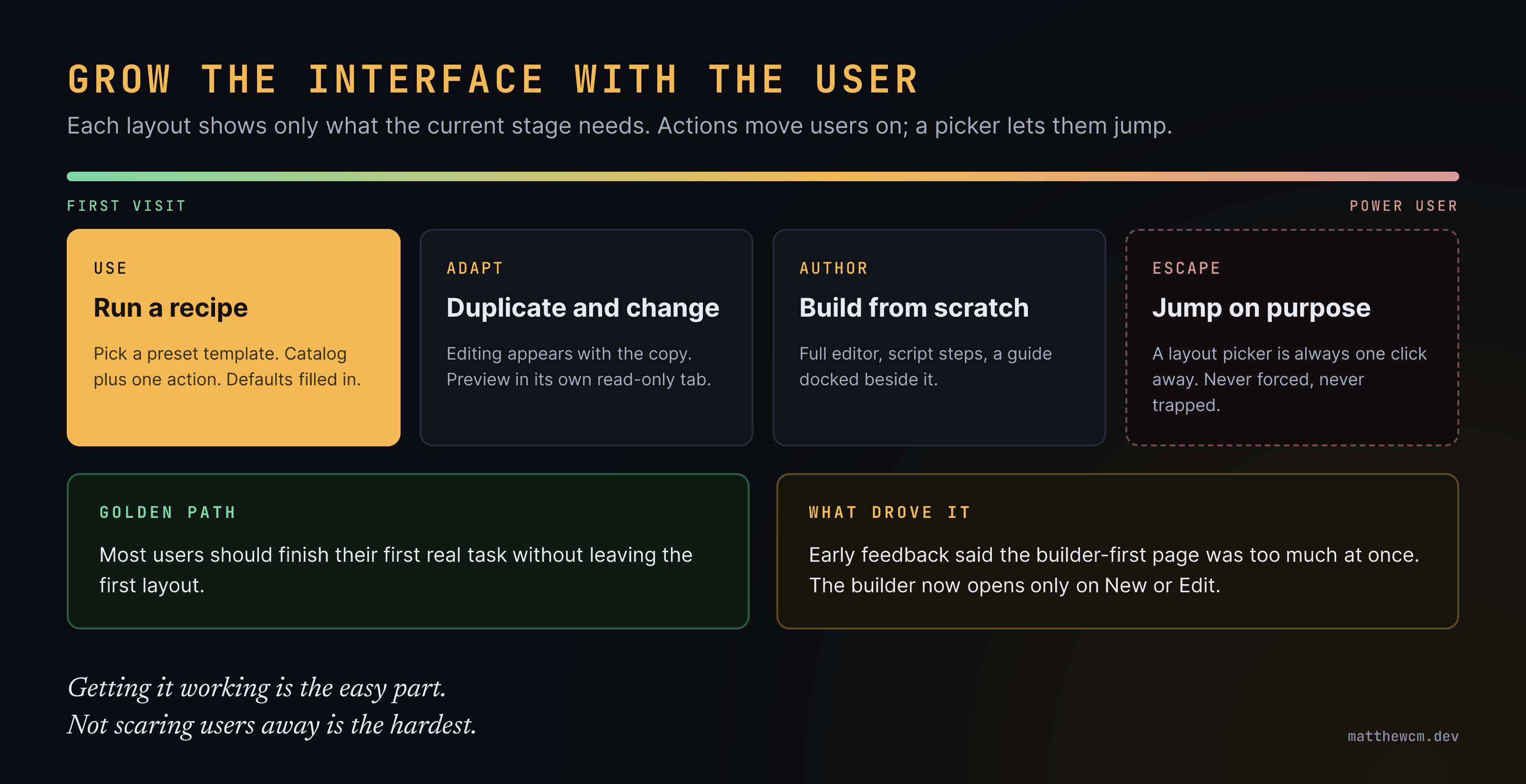
My first version opened on the builder. Early feedback was blunt: too much at once. People wanted to pick something that already existed and use it, and the builder was in the way.
So I split it:
- A simple view for the majority: a catalog of ready-made templates and the one action that matters.
- An authoring view for building and editing.
- The builder only opens on New or Edit. Edit opens a copy, so nobody breaks a template others rely on.
The feature didn’t change. What users saw first did, and that changed how it felt.
Three stages, three layouts
I now think of it as layouts that grow with the user:
| Stage | The user | The layout gives them |
|---|---|---|
| Use | Picks a preset template or recipe and runs it | Catalog plus one action. Defaults filled in. Nothing to configure. |
| Adapt | Duplicates a template and changes a step or two | Editing appears with the copy. A read-only preview, in its own tab. |
| Author | Builds from scratch, writes script steps | The full editor, with a guide and worked examples docked beside it. |
Most users should finish their first real task without ever leaving the first layout. That’s the golden path. Adapt and Author are there when they’re ready, not before.
How users move between layouts
Two ways, and you need both.
- Actions move the layout on. Clicking New or Edit shifts you into the authoring layout. You never have to know the layouts exist: the interface follows what you’re doing.
- A layout picker is the escape hatch. A plain dropdown lets anyone jump straight to the layout they want. The expert who wants the editor on day one shouldn’t have to “earn” it.
The rule: the interface can lead, but it can never trap. Shifting someone automatically is fine as long as they can see where they are and get back in one click.
Later, layouts could follow user traits or roles: some roles might start in, or be held to, a particular path. I’d use that sparingly. For most people, freedom to choose their own path matters more than the tidiness of a locked one.
Golden paths, recipes and sensible defaults
The first layout only works if there’s something good to do in it.
- Recipes and preset templates cover the majority of journeys. They should be the ones internal users already rely on: a layout and a set of templates that have been battle-tested in-house are the safest defaults you can ship.
- Duplicate, then change is how confidence grows. Copying a working template and changing one thing is much less frightening than a blank page.
- From scratch comes last, for the few who need it.
This is the same shape as a platform’s golden path (Golden Paths): pave the common road properly, and leave the other roads open. Platforms grow the same way, breadth first and depth when users ask (Explore, Expand, Extract).
Clutter-free, especially when the behaviour is complex
The more complex the behaviour, the calmer the screen has to be. A few rules that came straight out of feedback:
- Edit in place. Renaming something happens inline, on the thing itself, not in an extra panel that opens on top.
- Don’t stack. A preview squeezed under the editor makes both worse. Give the preview its own tab.
- Summaries are pages, not popups. A read-only summary of what you’ve set up deserves its own tab or section, where you can read it properly, not a dialog you dismiss.
- Hide the plumbing. If users never need to see the raw payload, don’t show it.
Make layouts data, not code
If the stages are hard-coded, every change is a release. If they’re named, saved layouts (system layouts that ship as defaults, which a user can switch between, and later save their own), then tuning the onboarding is configuration. You can adjust the first layout after watching real users without touching the feature. (Store them like saved views: versioned, validated on write, repaired on read.)
What I’ll measure
“It feels simpler” isn’t enough. The numbers I’d watch:
- Time to first success: how long until a new user runs something real.
- First-layout completion: the share of first tasks finished without leaving the Use layout.
- Moving on: how many users reach Adapt, then Author, and how long it takes.
- Jumping back: how often people use the picker to go back to a simpler layout. That’s a sign a later layout asks too much.
- Questions asked: support questions and “how do I…” messages per week.
The point
A feature nobody adopts isn’t finished. Users go where their needs are met (Users Not Customers), and the first screen decides whether they think their need will be met here.
So build the power, then hide most of it. Let the interface grow with the user: simple first, more as they ask for it, an escape hatch always in reach.
- #ux
- #onboarding
- #progressive-disclosure
- #cognitive-load
- #layouts
- #golden-paths
- #defaults
- #product-thinking
- #web-development
↩ Linked from (1)
- Compact, Not CrampedGrowing
…nd out why, and the expert gets a clean screen that only speaks up when it should. This is the same lesson as Grow the Interface with the User: design for user modalities, not for one imagined user.
↪ Links to (2)
Related by topic
- Seed
Large Integer IDs in JavaScript
Frontend craft - Seedcase study
Making Room for Career-Changers
Career - Seed
Prototype or Product? Scoping a Request Honestly
Career - Seed
requestAnimationFrame and High Refresh Rates
Frontend craft