Compact, Not Cramped
Modernising dense UIs for high-stakes work (money, wallets, bookings, live prices): visibility in proportion to consequence (quiet, visible, loud), effective state shown where it bites with its provenance, change surfaced early, explicit scope and blast radius, confirm the diff, and density as a preference, never a way to hide state.
On this page
- 1. Visibility in proportion to consequence
- 2. Show the effective state where it bites
- 3. Surface change early, not at the end
- 4. Make scope explicit
- 5. Show blast radius before saving
- 6. Confirm the difference, not the form
- 7. Density is a preference; information is not
- One screen, three kinds of user
- Anti-patterns to retire
- A checklist before shipping a high-stakes screen
The most dangerous setting in an app is rarely the one on screen. It’s the dropdown on another page that quietly changes every number on this one.
In high-stakes software (payments, wallets, bookings, live prices) a single configuration choice can move real money. A data-source setting, such as which exchange rates or fee schedule to use, changes every price that depends on it. A default wallet changes where funds go. A booking rule changes what a customer pays. If that choice was made on a settings page last Tuesday, the person looking at the price today has no idea it’s in play. That’s how user error happens: not carelessness, but hidden state.
The obvious fix is to show everything, everywhere. That’s how you get a cramped screen full of banners that experts learn to ignore and newcomers can’t read. Modernising a dense UI means doing the opposite: compact, not cramped.
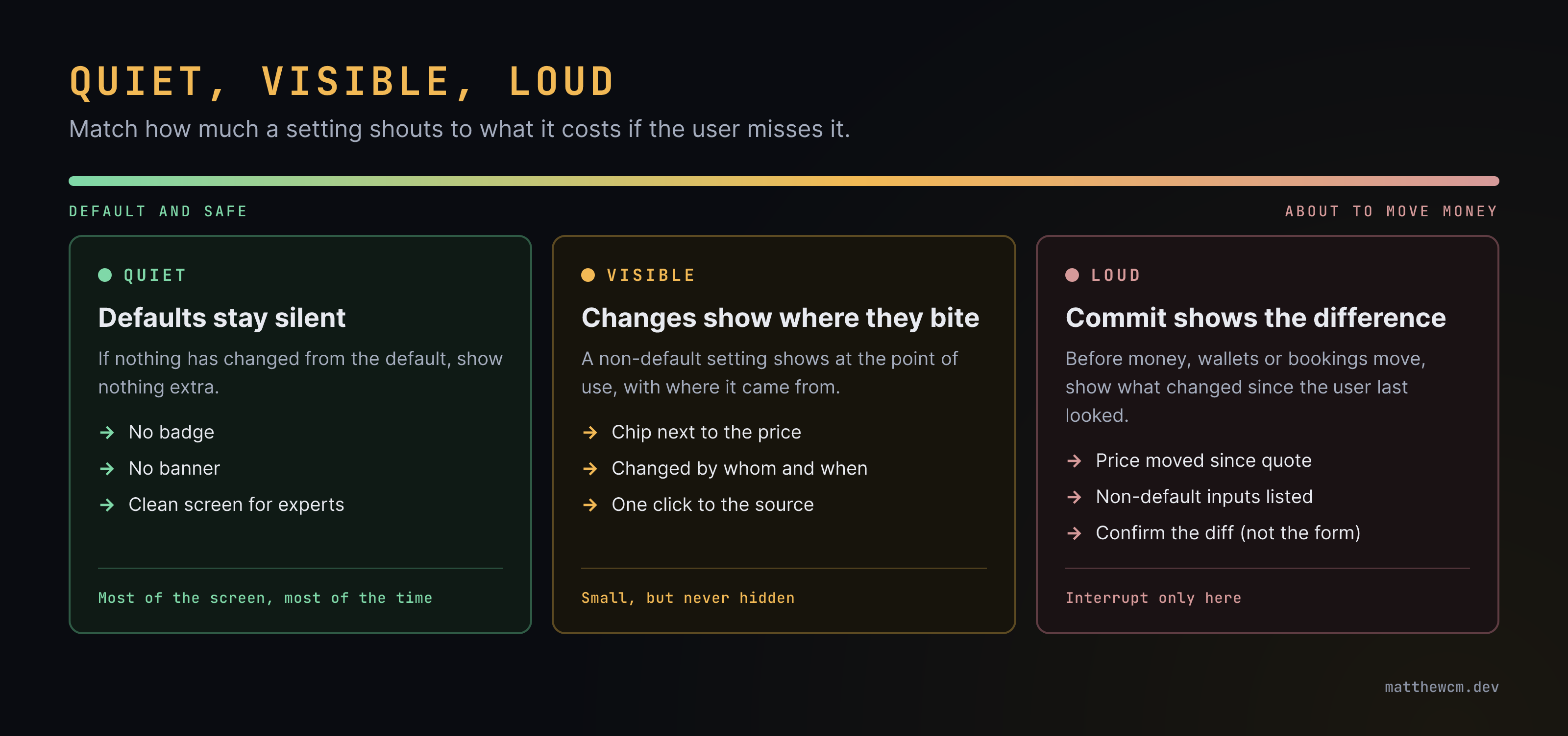
1. Visibility in proportion to consequence
Not everything deserves the same volume. Match how much a piece of state shouts to what it costs if the user misses it:
- Quiet: defaults stay silent. If nothing differs from the normal setup, show nothing extra.
- Visible: anything non-default, or anything that changed recently, shows at the point of use. Small, but never hidden.
- Loud: only at the moment money, wallets or bookings actually move. This is the one place you interrupt.
This single rule does most of the work. The screen is calm most of the time, so the signals that do appear mean something.
2. Show the effective state where it bites
Users don’t think “which config is active?”. They think “is this price right?”. So the state belongs next to the thing it affects, not on the page where it was set.
- A small chip beside the price: Custom rates or Fees: manual override. It only appears when the setting isn’t the default.
- Provenance on hover: where the value came from (system default, team setting, your override), who changed it and when.
- One click to the source: the chip links to the setting, already scrolled to the right field. The reverse should work too (see section 5).
Configuration that is layered (defaults, then team, then user, then this session) is a gift here: the layers are the provenance. Store settings as sparse overrides on top of defaults and “is this non-default?” becomes a cheap question. (Saved grid views work best the same way: sparse overrides on defaults.)
3. Surface change early, not at the end
Real-time systems change under the user’s feet. The sooner they know, the cheaper the mistake.
- Mark what changed since they looked. A brief highlight on a cell that moved, a dot on a row that updated, a count of changes on a collapsed panel.
- Show freshness. Live data carries its age (“3 s”, “stale: 2 min”) so a frozen feed is obvious.
- Never change what they’re about to confirm, silently. If the price moved between quote and click, the confirmation says so and shows both numbers.
- Prefer early, small signals over late, big ones. A chip that appears the moment a setting changes beats a modal at the end of a ten-step flow.
4. Make scope explicit
The most common hidden-state bug isn’t what a setting is, it’s who it affects. A dropdown that looks personal but changes the whole team’s prices is a trap.
Put the scope on the control itself, in words: Applies to: you, this session · your team · everyone. Use a different, deliberate control for wider scopes (a separate save with its own confirmation) so changing a team-wide or global setting never feels like changing a personal preference.
5. Show blast radius before saving
A settings page should answer “what will this touch?” before the user saves.
- Used by: “These rates feed 14 price lists and 3 open bookings.”
- Preview the effect: show a sample of before and after values for a change that alters numbers.
- Change log with undo: every consequential setting has a history (who, when, from what, to what) and a way back.
This is section 2 in reverse: the price links to its setting, and the setting links to everything priced with it.
6. Confirm the difference, not the form
Confirmation dialogs that repeat the whole form train people to click OK. A good commit step for money shows only what matters:
- what’s non-default in this order or booking;
- what changed since the quote or since they last looked;
- what’s irreversible.
If there’s nothing unusual, the confirmation is short and quick. If there’s something unusual, it’s the first thing they read. Experts aren’t slowed down on the normal path, and nobody is surprised on the unusual one.
7. Density is a preference; information is not
Compact components are often the right call: experts want more rows, more numbers, fewer clicks. But density should change spacing, labels and decoration, never which consequential state is shown.
- A compact mode drops padding and long labels, swaps text for icons with tooltips, and uses tabular numerals so columns line up.
- A comfortable mode adds labels and inline hints for people still learning.
- Both show the same non-default chips, the same freshness, the same change markers.
The compact toolkit: chips instead of banners, a status bar instead of pop-ups, alignment and typography instead of boxes, and colour reserved for meaning (one accent for “non-default”, one for “changed”, one for “danger”), never for decoration.
One screen, three kinds of user
The hardest part is that the same screen serves very different people:
| User | Knows | Needs from the screen |
|---|---|---|
| New | The task, not the system | Labels, sensible defaults, a safe golden path, nothing alarming that doesn’t matter |
| Mid-level | The common paths | Provenance on hover, links to the source, the confidence to change one thing |
| Expert | Everything, including the shortcuts | Density, keyboard speed, and to be told only when something is unusual |
Quiet-visible-loud works for all three. The new user isn’t buried, the mid-level user can find out why, and the expert gets a clean screen that only speaks up when it should. This is the same lesson as Grow the Interface with the User: design for user modalities, not for one imagined user.
Anti-patterns to retire
- Banner fatigue: permanent warnings that everyone has learned to ignore.
- Confirm-everything: dialogs on harmless actions, so the important one gets clicked through too.
- Remote control: a setting on another page that changes data here, with no trace on this page.
- Disappearing news: a toast for a money event that vanishes before anyone reads it.
- Colour soup: so many colours that the one meaning “this is not normal” doesn’t stand out.
A checklist before shipping a high-stakes screen
- Which settings can change the numbers on this screen? Is each one visible here when it’s non-default?
- Can a user see where a value came from, and get to its source in one click?
- Does the settings page say who a change affects and what it touches?
- Does the commit step show only the unusual and the changed?
- Can you tell if live data is stale?
- In compact mode, is any consequential state hidden that comfortable mode shows?
- Would an expert, a mid-level user and a newcomer each notice the one thing that’s wrong?
Related: Grow the Interface with the User · Keep the UI Dumb: Let Domain Experts Publish Schemas · AG Grid Performance Patterns · Users Not Customers
Calm screens aren’t empty screens. They’re screens where the only things that stand out are the things that matter.
- #ux
- #dense-ui
- #compact-components
- #cognitive-load
- #configuration
- #real-time
- #fintech
- #error-prevention
- #web-development
↩ Linked from (0)
Nothing links here yet — it’s a fresh shoot.
↪ Links to (3)
Related by topic
- Seed
Large Integer IDs in JavaScript
Frontend craft - Seedcase study
Making Room for Career-Changers
Career - Seed
Prototype or Product? Scoping a Request Honestly
Career - Seed
requestAnimationFrame and High Refresh Rates
Frontend craft